Monday 17 January 2011

OUGD301 Evaluation.

This module has been a Achievement in some area's of my design practice and a unfulfillment in others. I started this module with the aim of completing 4 comprehensive briefs and within this focusing my development on my design software skills. This would then lead to a more focused FMP and a more consistent portfolio.

I'm slightly disappointed that i was not able to complete all my briefs that i had set out to do. This is mainly due to mumps that i contracted during the end of the module that effected me longer than i had anticipated. Even though i had an extension to this module my body was not feeling 100% mentally and physically. However some human fault must be included in this. My management of my briefs was poor during this module. The studio brief ran over the allocated time limit of about 3 weeks. This was because i wanted to do too much with the brief with little time and that i was learning how to use illustrator at a more advanced level. Tutorials with tutors/ colleagues suggested that i reduce the amount of work i was doing for the brief and propose some of the work i was doing. Me being me i felt that i could get it all done and in the end couldn't. I should of been more realistic on what was achievable and what wasn't. I should of stopped putting deadlines back and finished the briefs at their current state.

Apart from this i was happy with the quality of the work produced and the skills i have learnt in the process. Attending indesign workshops have helped, however not all the skills learnt from them were put into practice until later in the module. Skills like baseline grids and style paragraphs have been very useful and will allow me to be more effective with my time in my FMP. Shortcut keys have also started to occur when i have been designing. Both in indesign and illustrator but more apparent in illustrator.

Illustrator has been a problem in the past for me, especially using the pen tool. So when this module began i specifically wrote in some briefs that would require vector graphics. This allowed me to get plenty of practice in using the pen tool and with some help from friends began to understand what i was doing wrong.

Overall this module has been a very interesting experience for me. I have learn't more things in 3 months than i have in the last 2 years. Mainly because i've worked the hardest i have ever worked before and because i had plenty of time to reflect when i was ill. The execution of my work has also improved. I began to get interested in minimal design at the end of year 2. You can now see this transition and how its effected my "style" of work.

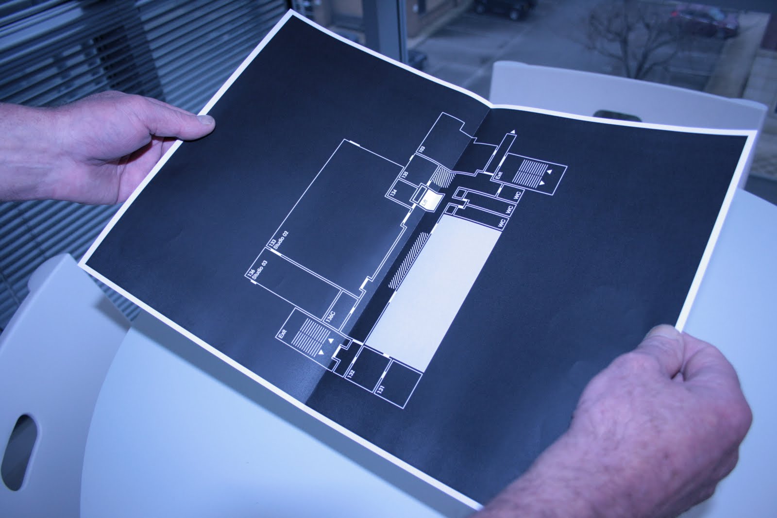
In-terms of my progression of my design practice, the direction i want to head into has become much clearer. I want to design industrial graphics that require clear and detailed information. The next briefs i produce will reflect this more and with everything i have learn't in this module will be much more of a success. The quality has greatly improved and so has the understanding. Its just the focus and decision making that i must improve for FMP. Something i'm confident can be done .

Action Plan For FMP:

  1. Be realistic with work that can be done and cannot be done.
  2. Stick to deadlines. Can always come back and improve the work later on.
  3. Get into a pattern with doing research then developing, doing research then developing etc. Not; doing all the research and developing at the end.
  4. Be more decisive with planning and development. Work Faster.
  5. Constantly re-evaluate the work being done with the brief. What is needed and what isn't.
  6. Continue the development of indesign and illustrator skills. Especially shortcut keys.
  7. Get myself into some workshops for finish's and process's. Use some finish's for my pieces
  8. Collaboration with someone with opposite skill sets.
  9. Blog daily or have a specific day of blogging and keep to it.


Minimal_Concept Board Board


Wednesday 12 January 2011

Minimal_Website.

Below is a mock-up of a proposed website for Weiss Magazine.

Minimal_iPad.

Below is the possible distribution of the magazine through Computer tablets, like the iPad and Amazon Kindle.

Minimal_iPhone Ap.

Application for Weiss magazine that will be accessible via iPhone and the Blackberry Torch.

Minimal_Cover Ranage.

Below is the range of magazines. Each issue will follow the same layout and grid structure apart from the images that will adjust slightly from time to time.


Minimal_Stock Tests.

Some stock tests for my covers. Chosen the top right stock because of its printability. The colour comes through better with the stock and so does the detail. The only problem is the cracking down the spine of the cover. I will have to edit this out on photoshop until i manage to get a better stock.


Minimal_Posters.

The image + type design direction will be chosen. However i need to possibly make the gutter of the grid a little tighter from 4mm to 2mm.


Minimal_Weiss Issue 02/03/04.

Below are some single spreads of potential content for 3 other issues. All three magazines follow the same grid system and layout.


Minimal_Final Magazine.

The most obvious thing i have done to the magazine through development is add a front cover. I'm still not entirely sure if the front cover works with the rest of the magazine content but it doesn't look out of place. The welcome page to the magazine has altered with the "welcome to the inaugural issue" now at the bottom of the page. The blue used to the page has changed from pantone 9400C to 2707C. Mainly because it works better with the front cover and because it makes the type more legible.

The typeface used has now changed. Originally i was using Futura STD for the headings and main body. Now its Eurostile. Reason are mainly down to the fact that i noticed that a colleague of mine was using the same type for his magazine and i wanted to be different. I also feel that it works better throughout the publication. In doing this i also dropped the point size from 8 to 7 for the main body of text. The leading is now 8.5 which makes the columns of text very tight and precise. The numbers for the pages have changed position and are now at the bottom not above the age name. This was mainly because i got sick of the fact the numbers kept changing hight. In doing this more consistency flows through the publication.

Page 06-07: I changed this page because the full spread image was pixelated. I also need a info page about minimalism so it felt right to have this at the begging and to remove the full spread image.

Page 16: This page changed from having four images to a signal one. I had the images in a pattern but this i felt didn't really work. The signal image looks good and works well with the layout. I also got a higher resolution of that particular image.

Finally; i have highlighted the names of the products so they stand out more. Some small details have been changed around the publication that you probably wouldn't notice at first glance. All these small details i feel are very important and make the publication what it is. Minimal has to be quality, without this minimal is just; nothing.


Minimal_Packaging.

Been looking all over Leeds and the web for some of this bubble envelope. First saw it when i got a issue of Process Journal through the post. Found a website that has it however they currently have no stock. Shame really because i really like it because it gives a sense of importance when you get it. I will have to settle for the standard envelopes from WHSmith.


Minimal_Final Proofing

Below are images of some of my spreads for my magazine. Made a few notes of adjustments that i might do. The main ones being the small ones; adjusting the type and leading. Some images need changing because of their quality. Hopefully after i do all my adjustments nothing will be wrong with the type and layout. Wish i had the seen Graham for this brief.


Minimal_Front Cover Three

Like both the magazines on white and black back grounds. The pantone blue/grey chosen from the swatch book looks good. The design i will chose will be the 6th design because of its emphasis on the name of the magazine.

Minimal_Front Cover Two.

A variation of different layouts. The final idea i like the most.


Minimal_poster Two.

Below i decided to add some colour and add some images. I like both directions ( image + type and just type ) but need to decide which design works the most.


Minimal_Paragraph Styles.

Paragraph styles is very useful. Its a shame i only started using it at the end. It ensures more consistency with your type through your document and allows my effective productivity when designing publications/ multiple pages. Something i will be using much more in the next module.


Make sure the selection box is ticked. I forgot.


Minimal_Poster one.

The design direction was to have just cleverly arranged type on a simple page layout. Readability is very important so that if it was in context people would know about the launch of this magazine. However i get this sense of feeling that its too simple and possibly needs some images showing the content of the magazine. They say "less is more" but i need to try a different direction.


Minimal_Baseline Grid.

Every type and grid bok i have ready always mentions using a baseline grid. My context blog mentions it for 10 steps of how to do good type and layout. So why have i not done it till now ??

Very useful piece of tech by In-design. Keeps everything structured.


Minimal_Magazine Five.

Added the grey pantone colour that i have got on the front of the cover magazine to the first page and final page. Not to sure if the legibility of the type is effected by it. Some changes to the some blocks of text. Found mistakes that include, rivers, not having enough tracking, Leading was more on some text than others etc.


Minimal_Magazine Four.

Didn't do to much on this development. Changed the first two spreads so that they was more central and adjusted some peaces of text.

20-21: Removed the full page length image of the building that is featured on page 06-07. The image was to dark compared to the other images and their for the page was not consistent. Replaced it with a much lighter image that fits better with the page.
32-33. Centred the column on page 33. Don't no why exactly but i question if it looks ok and does it work with the rest of the magazines layouts ???


Minimal_Magazine Three.

Mainly did some small tweaks of the layout of the images. Snapped them to the grid more and added the website address's to all the pages. Contact detail etc.

06-07: D-Rimmer images reduced to one image. The close up of the product was a nice image but had trouble finding somewhere that it would fit on the page.
26-27: Removed the 4 small images and placed a single image close to the centre of the spreads. The previous pages had the same theme so i wanted to mix it up a bit more.


Minimal_Magazine Two.

I've made a few adjustments to the magazine.

All the pages with "Weiss Summer 10" down the edge of the page have been slightly adjusted for constancy.
8-9: slotted in a extra page to break up the magazine so it doesn't go from contents to content straight away. Full image spread of a building gives off a visually striking image of minimalism.
10-11: switch spreads with 12-13 because the images were not strong enough visually for the opening content.
12-13: Reduced images to two from five. The straight shot of the braun kettle works much better for the page.
14-15: Removed two of the images because the quality was not the best.
24-25: Adjusted the layout. Wasn't sure about the quotation in the middle of the page. It didn't work well with the magazine.
26-27: Shortened the column width from 6 columns to 4. Also reduced the content.
28-29: Reduced column width down from 6 to 4.
30-31: Got some information content about the designers and removed the full bleed image of the model because it didn't work with the magazines overall layout. Striking image yes. Added 4 images along the bottom middle of the page instead.
32-33: Adjusted the images by one horizontal columns width so it was inline with the title page.
34-35. Switched images because of the quality.
36-37: Wasn't sure about the halftone image. Didn't work well with the magazine.
38-39: Changed some of the images. To much variation of colour, to bright.
41: layout change.


Minimal_Magazine one.

The layout i have chosen is very open with plenty of white space to allow the eye to focus on the design and the little details. I have chosen a module based grid so that i can keep the same consistency of layout throughout the magazine. However the positioning of the content is occasionally adjusted so that there is a little bit of variation. Hard to explain!


Minimal_Proof Reading.

Just a few prints of possible covers for my magazine with a few notes and idea's.


Minimal_Tags

Below are some idea's for labels that will be applied to the envelopes for delivery. Legibility being the integral issue.


Minimal _ Front Cover Development One.

After coming up with some initial idea's for my front cover, i began to apply this in In-design. I wanted a layout that was simple and gave plenty of space. I number of idea's were tried but after going to the shop at eleven at night i came across one problem. I had not thought about how the magazine would be displayed on the shelf. The name of the magazine had to be at the top and not at the bottom or in the middle. Valuable time was wasted.


Minimal_Page Layout

Before i started to create the magazine in Indesign i wanted to see if the size was appropriate and to see how the chapters would flow. The format is of a standard bound magazine, however i wanted something that was much smaller in size. The dimensions being 185mm x 235mm. This size allows the reader to carry the magazine with ease: in their hand, under the arm or in their handbag. Most standard size magazines are heavy and very flimsy. This has structure and importance. Its not something you buy and crease. The size also goes with the minimalism theme and will also reduce cost/ climate damage with distribution.


Minimal _Logo Development.

Below i started to explore different typefaces for my magazine. All the typefaces chosen were San Serif because of their connection with Swiss Design (Helvetica). I wanted something bold that had some strength but at the same time had an element of sophistication. Normally i would have chosen helvetica straight away but i wanted to move away from it. Eventually after going through list upon lists of typefaces i cam across Vectora LT Std 75 Bold.


Minimal_Content.

Below is a stockpile of images that will be placed into the magazine. These images have been sourced from various websites online and have not been taken by myself.


Minimal_Initial Idea's

Below is list of design directions that i could do for my magazine. The first thing i had to do was sort out a name. A few things were going through my head during the weeks whist i was doing other briefs. Some people recommended that i kept it to Minimal Magazine and some just like the name "Manual". Manual appealed to me very much however i found out from searching on the internet that it had already been taken by some extreme skateboarding magazine. Idea's kept on flowing until i came across "Weiss" that means white in German. Most things that are minimal are white or set in context with white spaces. If you then break this down you find that white can translate to an empty, blank page; its simplest form. Because of this i felt that the name Weiss was appropriate and had an importance about it.


Tuesday 11 January 2011

Minimal_Problem.

Generally i'm very much a minimalist. Over the years my image has changed from self obsessed "brands" junky to Indie extremist. However one thing has always been the same; i like things tidy, organised and simplified.

Since i started studying Graphic design at the Leeds College of Art, my hunger for all things minimal has intensified. I'm still into my brands but more selective over what i am buying. Im not just buying for buying sake because its by Raf Simons, i'm buying because it makes me feel good and because its for the long term.

The problem i have noticed is that there is no magazine aimed at celebrating minimal design. Most magazines out there, are for men, women, men and women; they are all the same junk. These magazine aim at three categories of class (Lower Class, Middle Class, Upper Class) and don't tend to specifically aim at a certain group. I know that there are plenty of people who appreciate simplified, efficient, minimal design and it needs to be exploited.

Solution

The solution is a minimal magazine ( no current name ) that will celebrate the latest design in fashion, architecture, technology, music and art. However it will be more than a magazine, it will be a manual. If you already no how to be a minimalist you will have a quarterly update of the newest design. If your sick of life and want to change your image/way of life then this magazine will help you.

Design Direction.

The manual will give the impression of being more like a book than a magazine with chapters for each area of content. The manuals layout will be very open, with plenty of white/ negative space that will allow the eye to absorb and not get lost in the page. This will also tie in well with the minimal theme.

Wednesday 20 October 2010

Studio_Layout Development.

Below i had an idea of adding a fold out page for the studio contents brochure. This would have a map showing category i.e Furniture Studio one and the locations for each piece. However i don't think this is necessary since we have a signage system that shows all this. The point of the brochure is to have all the little details that are not shown on the signage.


Tuesday 19 October 2010

Studio_Signage Development Three.

More layouts. Need to make a decision soon on which one i am doing. Plus i need to write up a introduction to the function of the signage. One this is sorted i can apply it to the rest. Not too sure if i'm doing the storage cupboard now. Was going to develop something a bit different that would tie in with the other designs. Time is of the essence.


Studio_Signage Development Two.

Below i have sorted the issue of the icons. I have made the format bigger and removed the F which was going to be the code for the item ( F = Furniture ), just leaving ti with a number instead. Not happy about the fact that i have spent so long on this problem.


Studio_Signage Development Four.

Below are just a few potential layouts for my signage. However i do have a concern about the equipment symbols - are they too small. 6 pt is pushing it. From the tiled print out i did it seems ok when your standing at a reasonable distance. It is after all going to be aimed at students aged between 18 - 30 something. Not at 60+. But does this go against the whole function of a sign. To display information in a easy to understand way. Legibility !


Studio_Signage Development One.

The issue i am having at the moment is fitting all the individual icons for each piece of equipment for studio one. I have started on the smallest studio with the most equipment so that it make it easier for me later. However its proving very difficult. The two thing i can do are the following. Change the map design so that it only shows the studio not the rest of the studio's or change the format to A1. The format seems the best option however i have spent too much time debating on what to do. Need to be quicker in my decision making.


Monday 18 October 2010

Studio_Mapping Icons Four.

I have created a number of different icons that i might use. The one i prefer after speaking to some colleagues is the box with the "x" in the centre and code. A number of codes will have to be sorted for the equipments. Im not sure if i want a individual code for each piece of equipment or just a code for the type. Could be a bit too much and a little hard for the user of this map to understand if it was a individual code.


Studio_Mapping Icons Three.


Studio_Mapping Icons Two.


Studio_Mapping Icons One.