Showing posts with label OUGD301 Studio. Show all posts
Showing posts with label OUGD301 Studio. Show all posts
Wednesday, 20 October 2010
Studio_Layout Development.
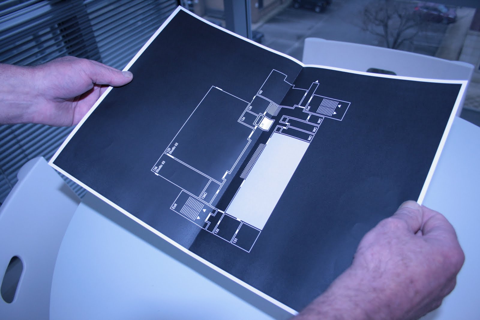
Below i had an idea of adding a fold out page for the studio contents brochure. This would have a map showing category i.e Furniture Studio one and the locations for each piece. However i don't think this is necessary since we have a signage system that shows all this. The point of the brochure is to have all the little details that are not shown on the signage.


Tuesday, 19 October 2010
Studio_Signage Development Three.
More layouts. Need to make a decision soon on which one i am doing. Plus i need to write up a introduction to the function of the signage. One this is sorted i can apply it to the rest. Not too sure if i'm doing the storage cupboard now. Was going to develop something a bit different that would tie in with the other designs. Time is of the essence.
Studio_Signage Development Two.
Below i have sorted the issue of the icons. I have made the format bigger and removed the F which was going to be the code for the item ( F = Furniture ), just leaving ti with a number instead. Not happy about the fact that i have spent so long on this problem.
Studio_Signage Development Four.
Below are just a few potential layouts for my signage. However i do have a concern about the equipment symbols - are they too small. 6 pt is pushing it. From the tiled print out i did it seems ok when your standing at a reasonable distance. It is after all going to be aimed at students aged between 18 - 30 something. Not at 60+. But does this go against the whole function of a sign. To display information in a easy to understand way. Legibility !
Studio_Signage Development One.
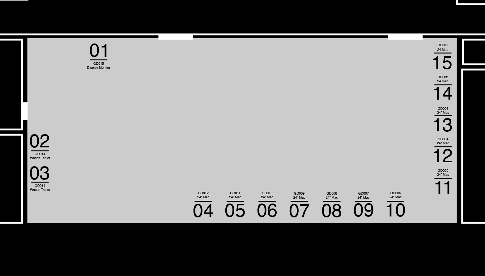
The issue i am having at the moment is fitting all the individual icons for each piece of equipment for studio one. I have started on the smallest studio with the most equipment so that it make it easier for me later. However its proving very difficult. The two thing i can do are the following. Change the map design so that it only shows the studio not the rest of the studio's or change the format to A1. The format seems the best option however i have spent too much time debating on what to do. Need to be quicker in my decision making.
Monday, 18 October 2010
Studio_Mapping Icons Four.
I have created a number of different icons that i might use. The one i prefer after speaking to some colleagues is the box with the "x" in the centre and code. A number of codes will have to be sorted for the equipments. Im not sure if i want a individual code for each piece of equipment or just a code for the type. Could be a bit too much and a little hard for the user of this map to understand if it was a individual code.




studio_Mapping Development six.
Below are 4 possible map designs i might use. Not entity shore which one it will be, each one is a little different. Going to concentrate on the icon development now before i make a decision.


studio_Mapping Development Five.
The mapping designs are starting to improve a lot now and i'm happy with the direction i am going in. Apply colour to the zone in use is very effective and would stand out when on the wall.


studio_Mapping Development Four.
Still not happy with the deign even when i applied colour. I ended up having each zone of the map with its own wall, so it became individual to that space.


studio_Mapping Development Three.
The thin line approach i'm not too sure about. One because the visibility of the design is effected and two because it looks like its been designed very quickly without any consideration.


studio_Mapping Development Two.
Using the document grid on indesign i started to design a map the had a little more structure and substance. As you can see the result is pretty good, however i do get a feeling that its lego bricks for some reason and feel that i can do much better.


Studio_Mapping Development One.
Very much as standard trace of the existing map that amber supplied to me. After showing this design to a few colleagues of mine, they all liked it. The final design at the bottom is a simplified version with a little less detail. Even though it does its job, i want to develop a more individual style of mapping.


Subscribe to:
Posts (Atom)